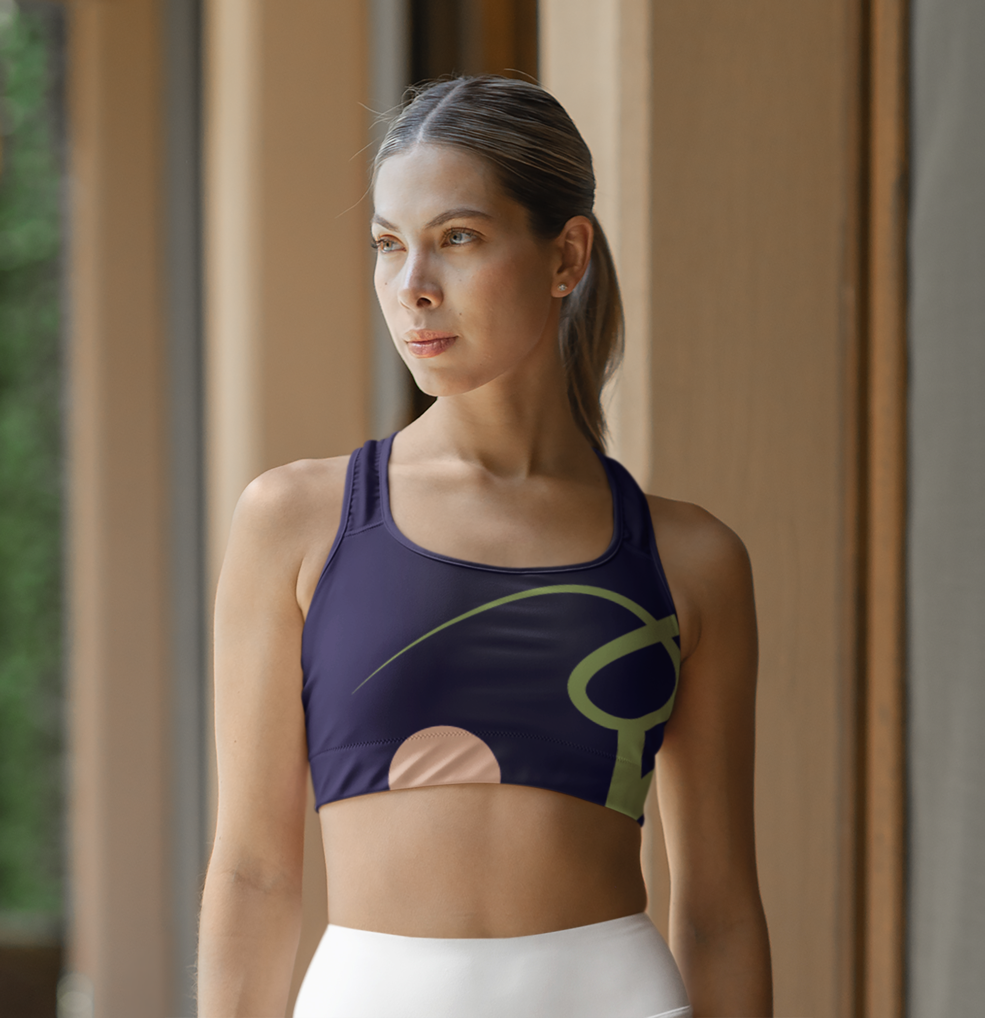
Amber Attuned Yoga Branding
Amber Attuned Yoga is centered on "Yoga guided by listening"—a practice that prioritizes internal attunement and nervous-system regulation over outward performance. The visual identity must serve as a digital extension of this safe, grounded, and subtle environment.
Problem
Balance warmth and space: Designing a digital sanctuary that feels breathable and calm without appearing clinical or cold.
Targeting the therapeutic user: Creating an approachable interface for adult women seeking gentle, restorative movement over performative fitness.
Solution
Regulation-First Design: Utilize organic lines and spacious layouts to guide user into a state of stable presence and focus.
Amber Anchor: Leveraged a signature Lake Life palette to inject warmth and vitality into the calm, neutral backdrop of the site.
Target Audience
Primary Audience:
Overwhelmed and Burnout Professionals: Adults aged 25–50, often working high-stress corporate or creative jobs.
Life Transition and Wellness Builders: Women aged 25–45 navigating major physical shifts (pregnancy, postpartum recovery, or recovering from chronic illness/injury).
Secondary Audience:
The Conscious & Holistic Yogi: Adults aged 20–60 who are already familiar with standard yoga (Vinyasa, Hatha) but are looking for something deeper.
Aspiring Instructors and Advanced Practitioners: Experienced yogis or 200-hour certified teachers looking for continuing education.

User Personas
Sarah, 40
-Status: Mom of two (ages 4 and 7 )
-Occupation: Freelance Creative Director
-Attunement Need: Sarah’s life is high output. She is the “anchor” for her family and clients, which leaves her nervous system in a constant state of “high alert”. By the time she reaches the mat, she is mentally exhausted. She needs a practice that acts as a “reset” button for her sympathetic nervous system.
-Pain Points: “ Decision Fatigue”, shallow breathing habits, the feeling of being “poured out” without nothing left for herself.
-Aspiration: A class that feels like “a digital detox”. She values the subtle precision of the Amber Attuned method, because it forces her to focus on internal alignment rather than outward multitasking.
"“
Elena, 31
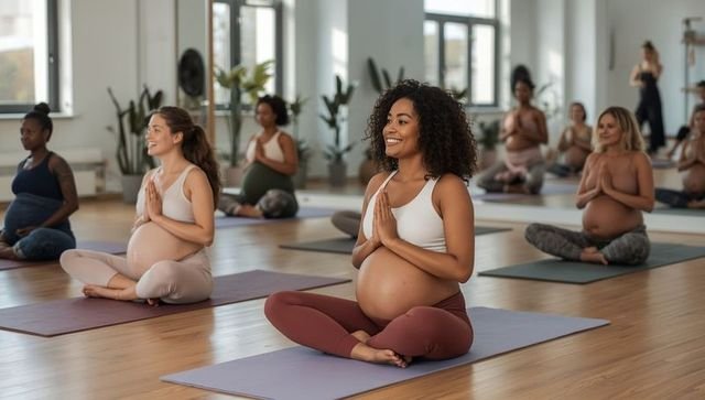
-Status: 24 weeks pregnant (Second Trimester)
-Occupation: Environmental Consultant
-Attunement Need: Elena is experiencing a massive shift in her physical identity. She feels “noisy” in her own body—breathlessness,lower back tension and a mind that is constantly racing towards baby “prep” lists.
-Pain Points: Overwhelmed by “performanced-based” prenatal fitness; feeling disconnected from her core; physical discomfort in traditional yoga poses.
-Aspiration: To find a “safe and grounded” space where she can practice intuitive movement that honors her pregnancy without making the only thing she is defined by.
Visual Guide
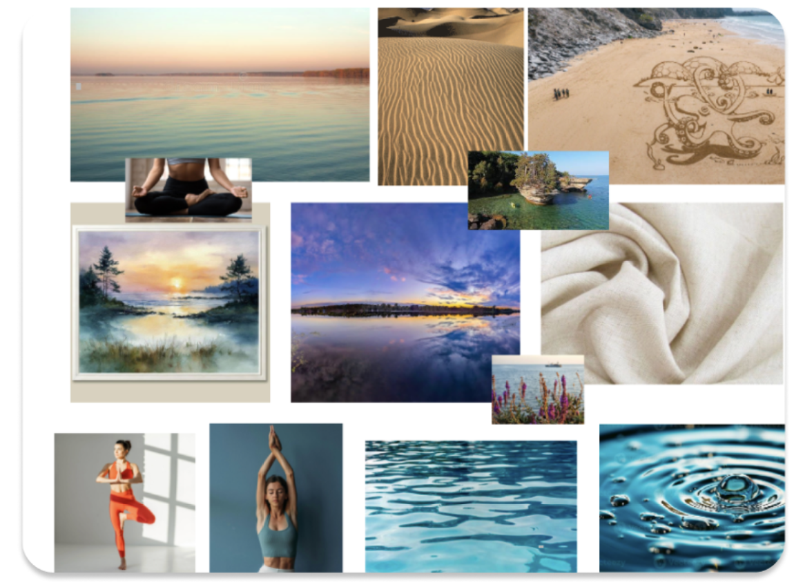
The visual direction for Amber Attuned Yoga is centered around the transition of day into night—specifically the stillness of dusk and dawn. By pairing quiet yoga practices with images of reflective still waters, glowing horizons, and serene shorelines, the brand evokes a sense of deep presence, mindfulness, and cellular rest. Elements like soft, folded linen and smooth sand represent the physical comfort, grounding, and ease we aim to cultivate on the mat.
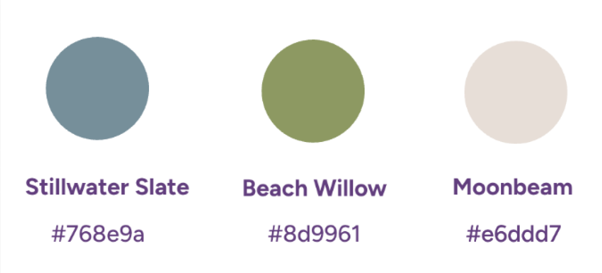
Our color palette is drawn directly from quiet, natural landscapes at twilight. Stillwater Slate brings a soothing, meditative cool tone that represents deep breath and mental clarity. Beach Willow introduces a soft, organic sage green that connects the practice to nature, healing, and growth. Finally, Moonbeam offers a warm, sandy neutral that acts as a gentle, comforting foundation, keeping the entire brand feeling spacious, calm, and deeply restorative."
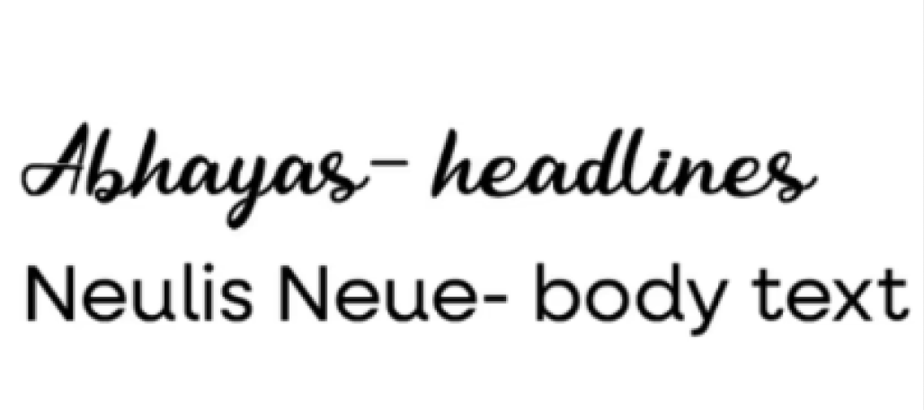
Headline Typography — Abhayas
For our primary headlines, we selected Abhayas. It is an elegant, high-contrast serif typeface that instantly introduces a sense of timeless tradition, mindfulness, and quiet authority. The subtle curves and fluid serifs mirror the organic flow of a yoga practice, making the headers feel intentional, grounded, and deeply calming.
. Body Typography — Neulis Neue
To complement the classic elegance of our headlines, we pair it with Neulis Neue for body text. Neulis Neue is a clean, modern sans-serif with unique, slightly rounded characteristics. This keeps our dense informational sections—like the therapeutic solutions and user personas—incredibly legible and highly readable on digital screens, while still maintaining a soft, friendly, and human touch.
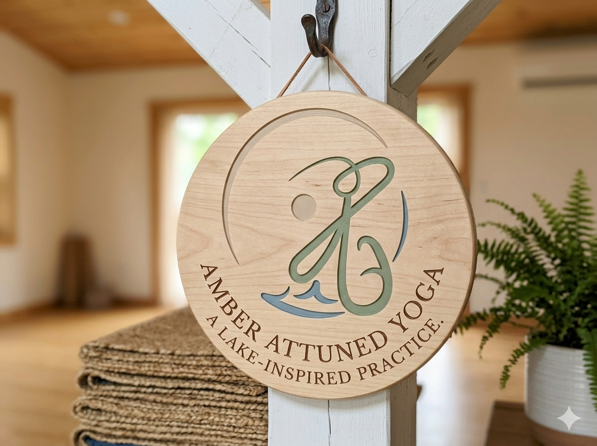
Logo Iterations
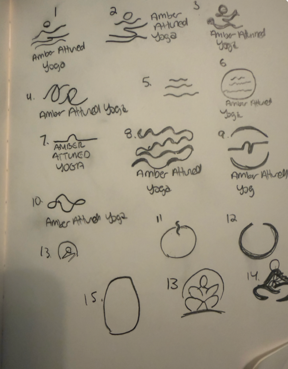
Sketches
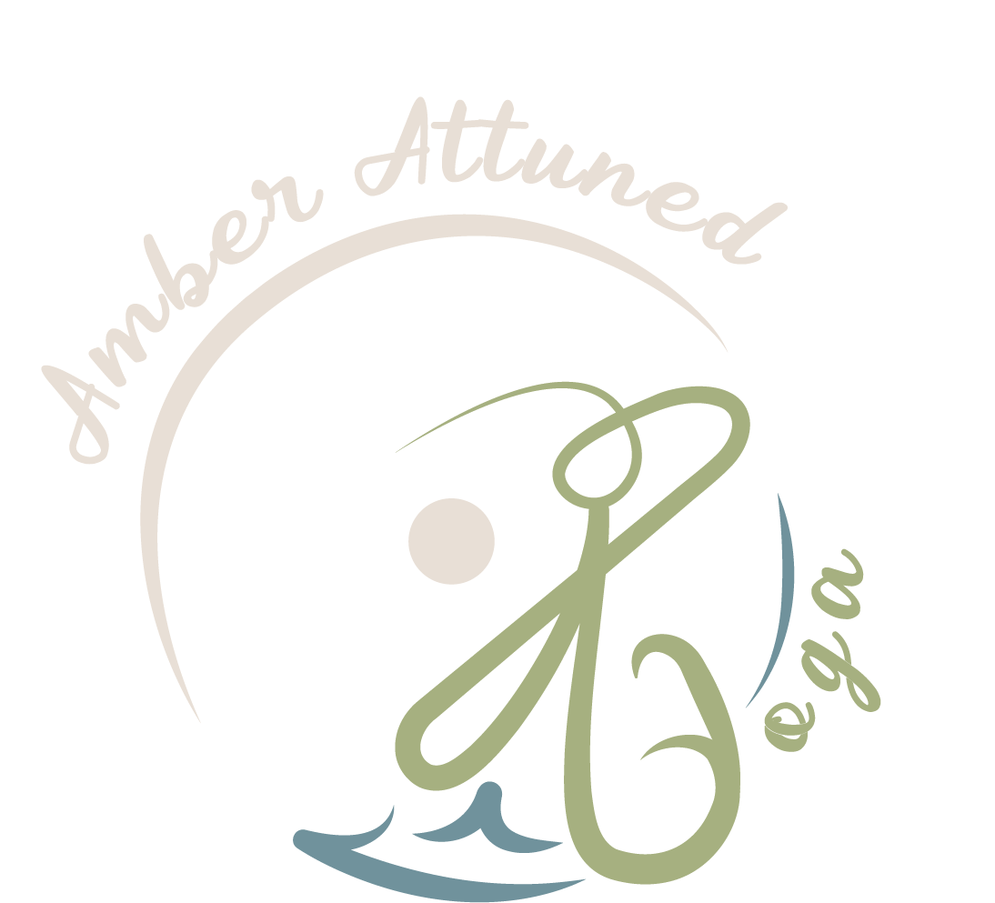
Initial brainstorming and thumbnail sketches exploring raw concepts, fluid wave patterns, and the integration of the human silhouette with the letter 'A'.
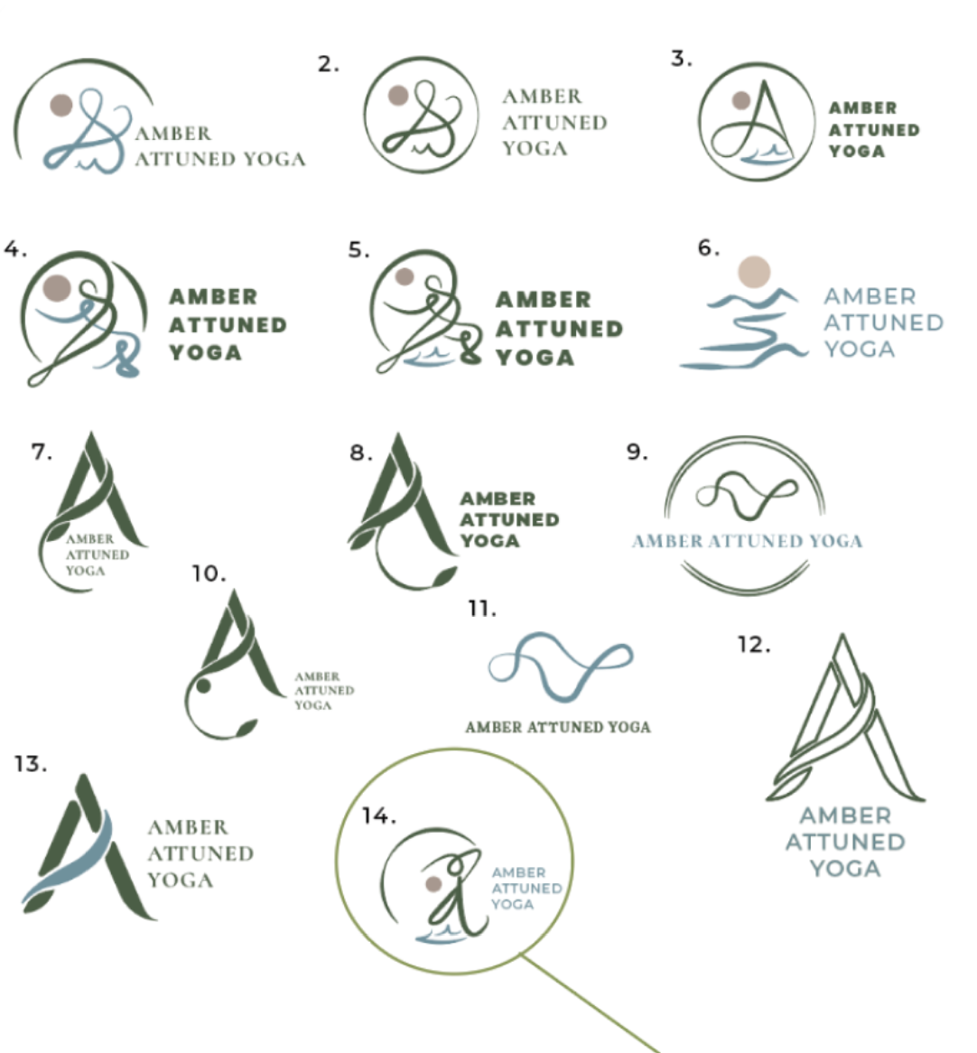
First iterations
Translating hand-drawn concepts into digital vectors, experimenting with different geometric containers, font pairings, and line weights to establish a balanced brand mark.
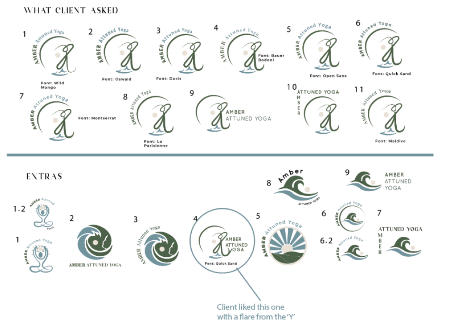
Second iterations
Wave Spirals & Enclosures: Testing heavier, enclosed badge-style icons for a more compact and grounding brand mark.
Sunburst & Horizon Motifs: Exploring abstract landscapes that more literally depict the dawn and dusk themes of the brand.
Stacked Typography: Adjusting how the hierarchy plays out when the business name is separated from the iconography entirely.
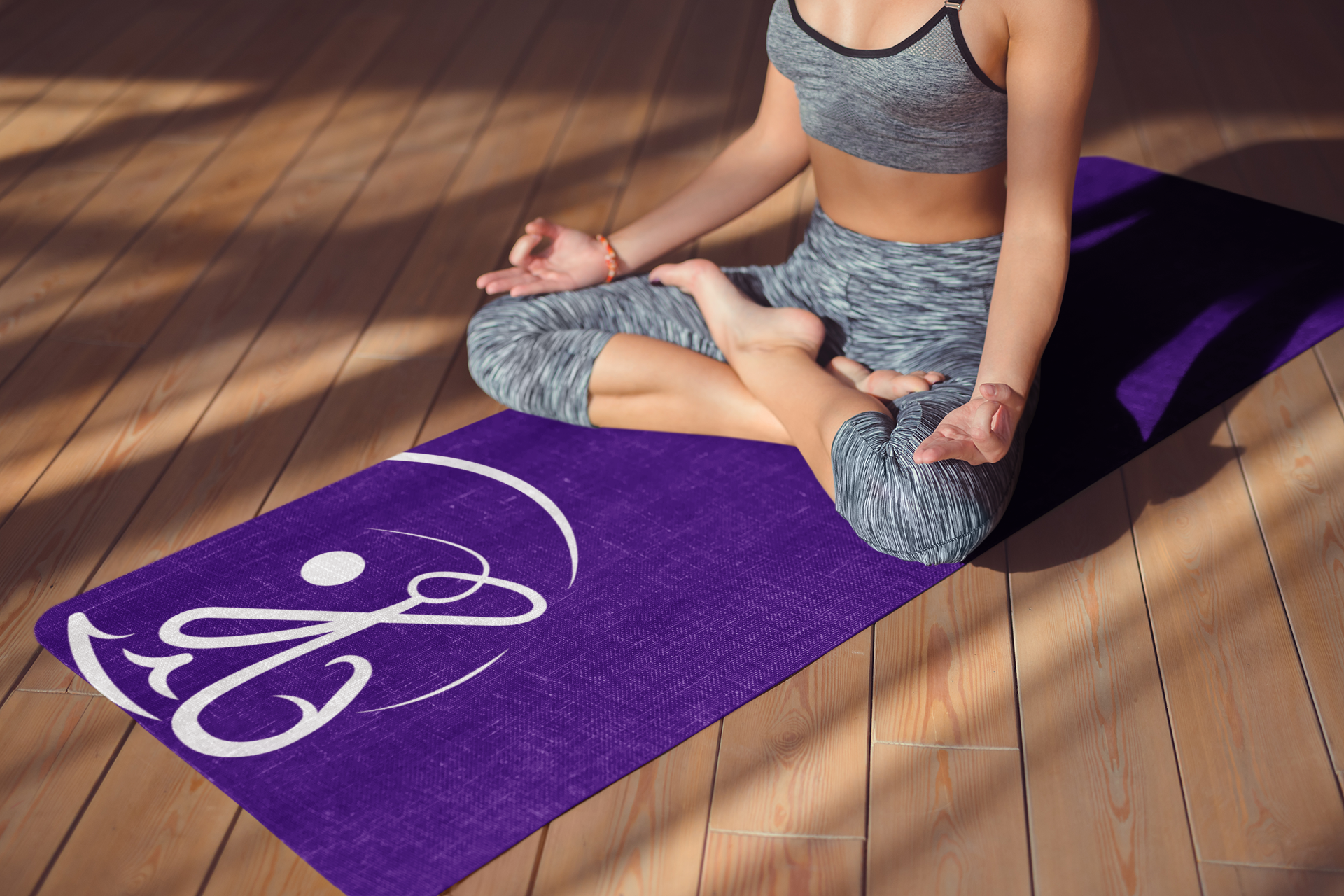
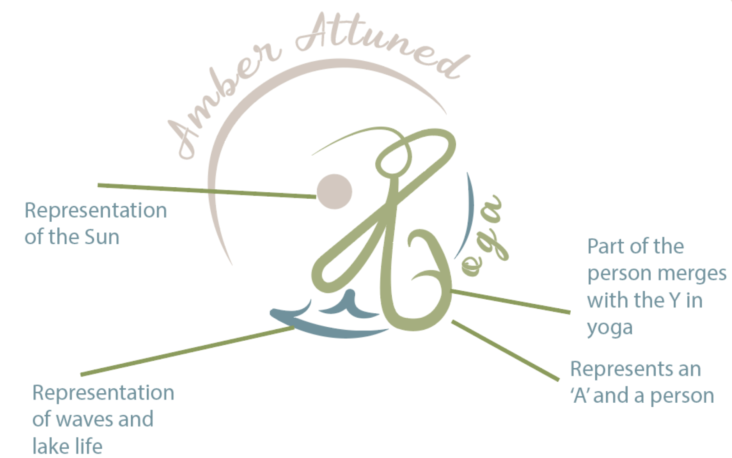
Logo Breakdown
Social Media Collateral
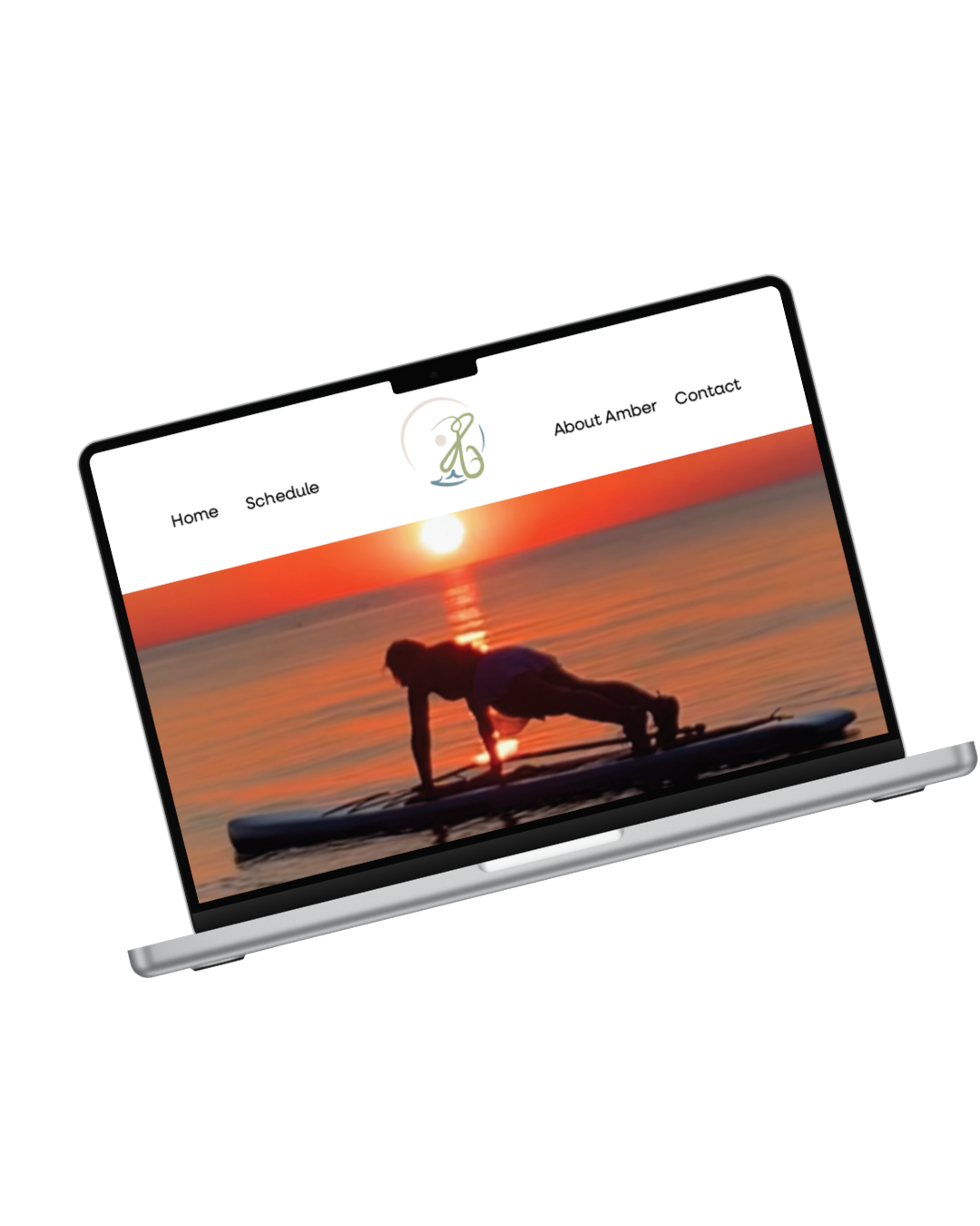
website
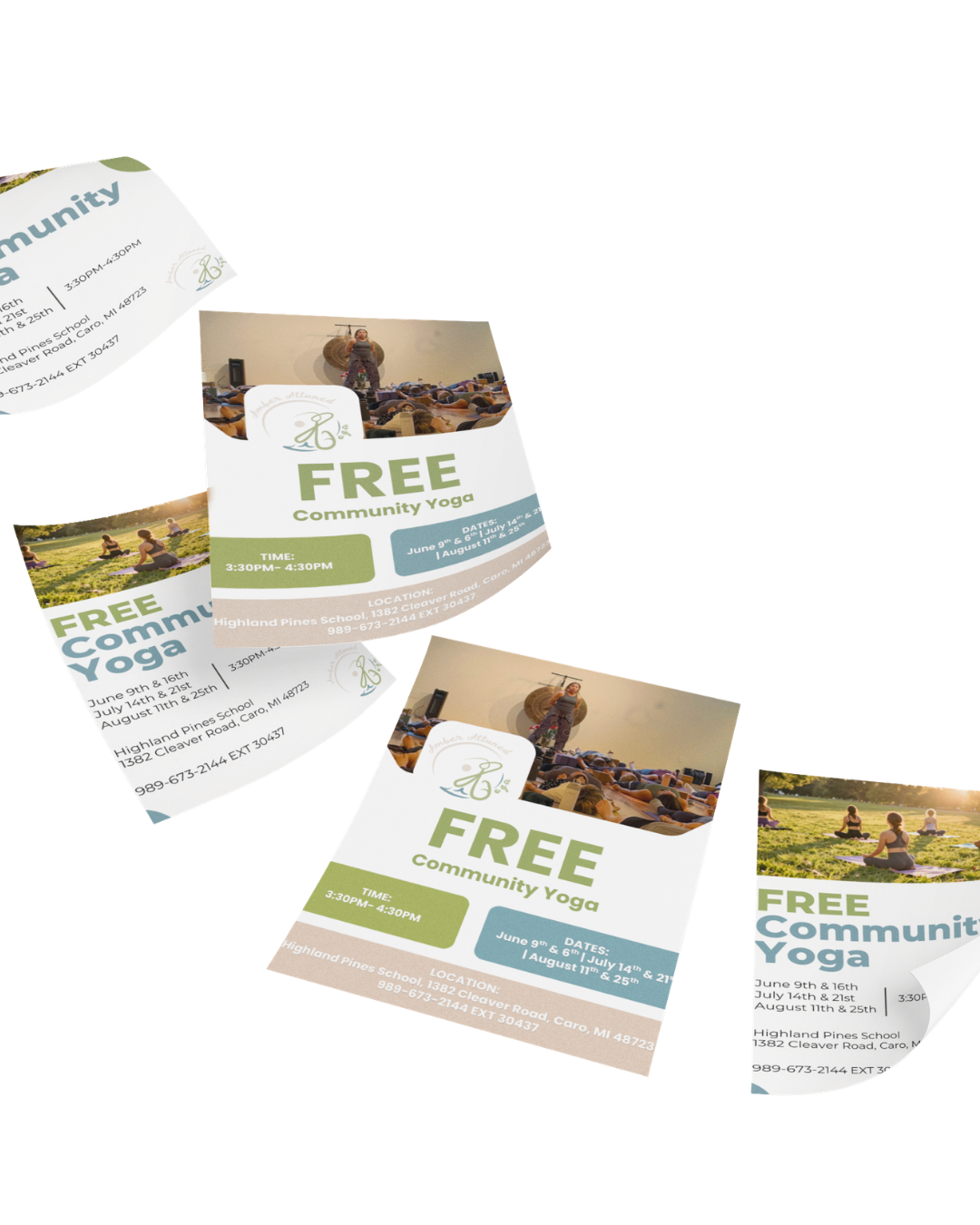
fliers
Crafted for community outreach. These print materials use clean, restorative layouts and crisp typography to share "Free Community Yoga" details, ensuring the brand feels highly professional, welcoming, and accessible in local physical spaces.
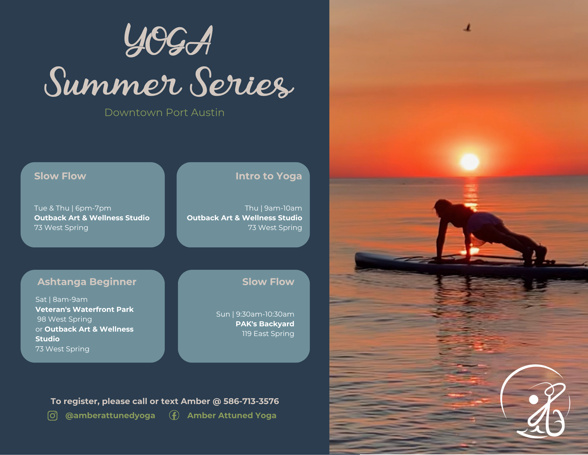
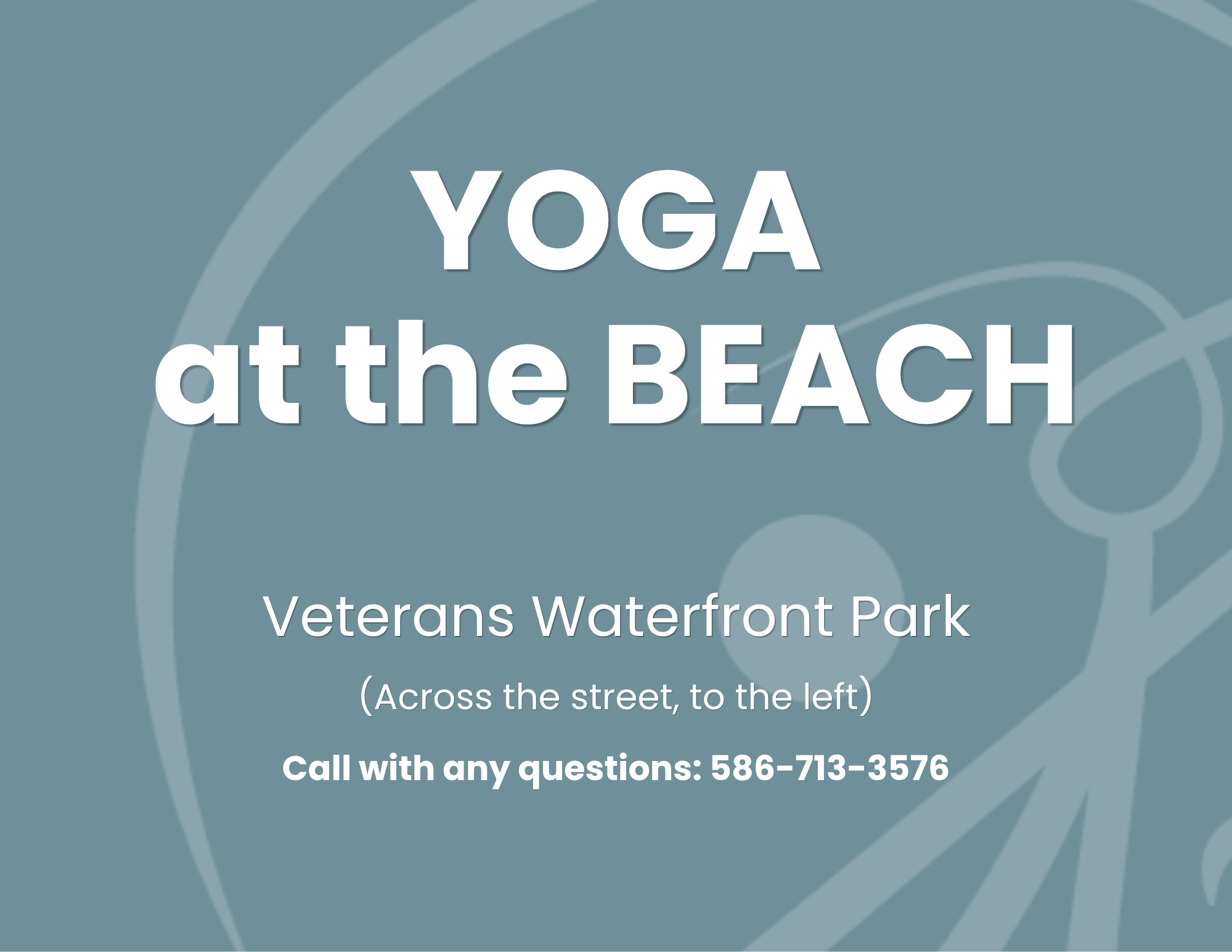
BaNNERs
Designed to promote outdoor community offerings for Amber Attuned Yoga, these promotional banners blend serene, slate-blue hues with high-contrast typography and evocative sunset imagery. The left directional banner uses clear, high-impact sans-serif lettering and subtle logo watermarks for maximum legibility on-site. The right promotional graphic showcases the "Yoga Summer Series" schedule, combining elegant script typography with structured content cards for an organized, visually inviting look.

Business Cards
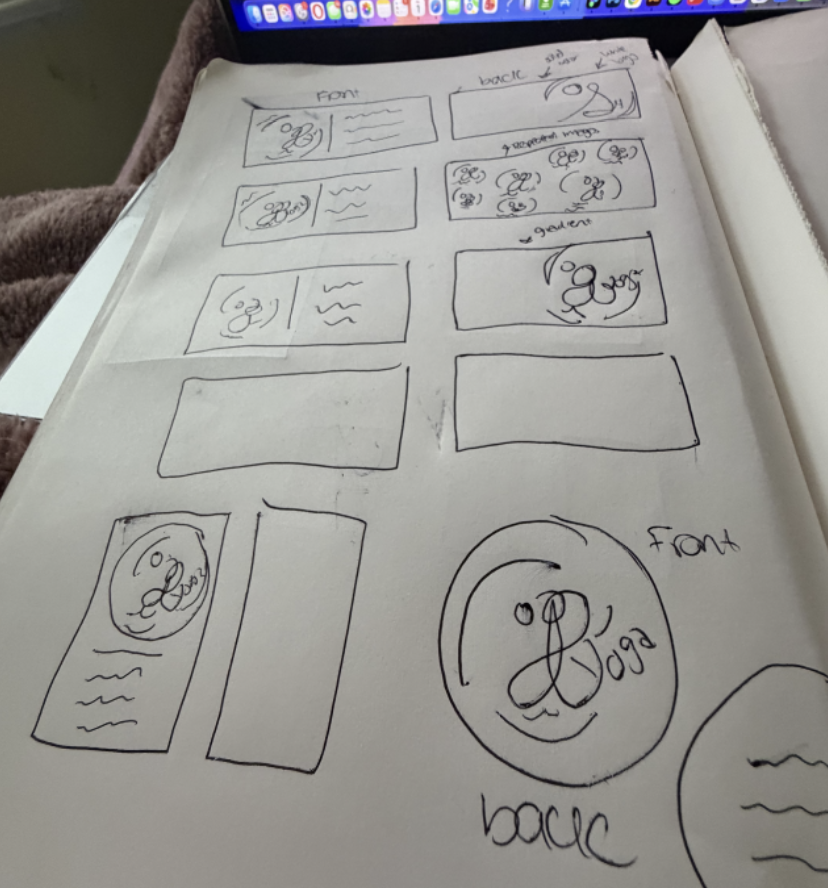
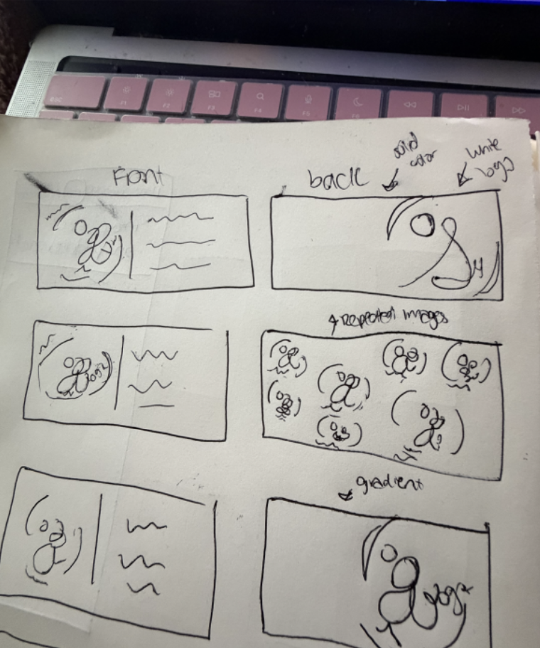
Initial layout brainstorming, testing front-and-back orientations to map out where the contact details should sit in relation to the primary logo mark and repeating background textures.
Sketches


Digitized Versions
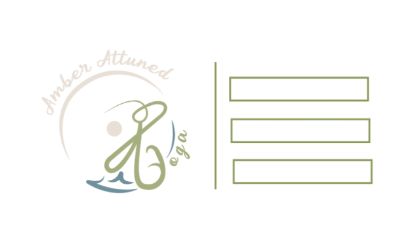
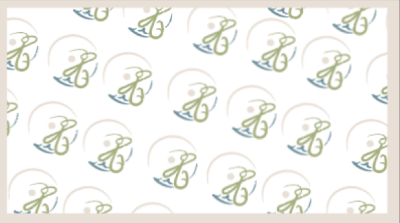
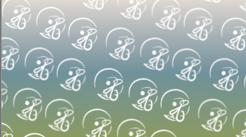
Translating those thumbnail layouts into digital prototypes. This includes experimenting with clean, minimalist card backs, solid brand-color blocks, and soft gradient patterns featuring a repeating, screen-printed style of the circular monogram.
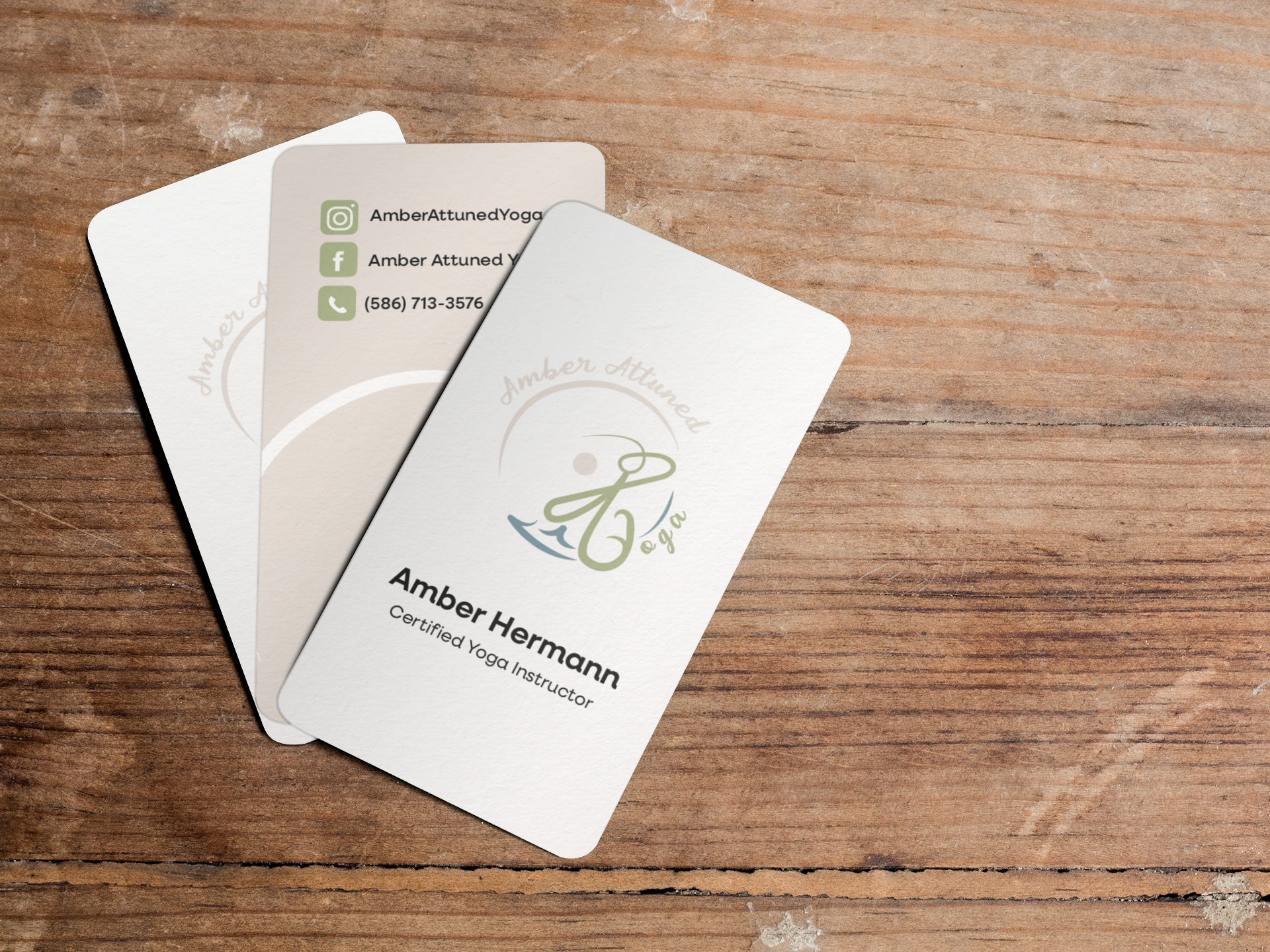
Designed for Amber Attuned Yoga, this business card layout reflects a serene, grounded, and holistic aesthetic. Utilizing soft, organic tones—earthy sage green, warm beige, and muted slate—paired with rounded corners and clean typography, the card creates an inviting, tactile connection. The front highlights the fluid, flowing logo mark, while the back presents essential contact details with clear, accessible icon design
Final Version