Galaxy Eye Records
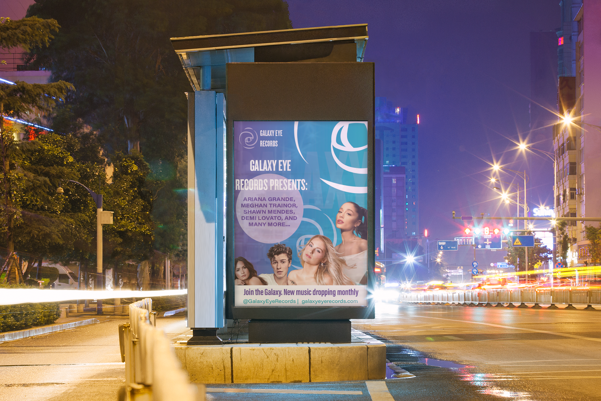
I have curated a universe where pop music meets its cosmic destiny. Our roster features the brightest stars—from Kelly and Demi to Ariana, Meghan, Camila, Ed, and Shawn—all shining within a sleek, sophisticated blend of rich blues, purples, and dynamic gradients. Discover a label that's totally new, yet perfectly in tune with the sound you love.
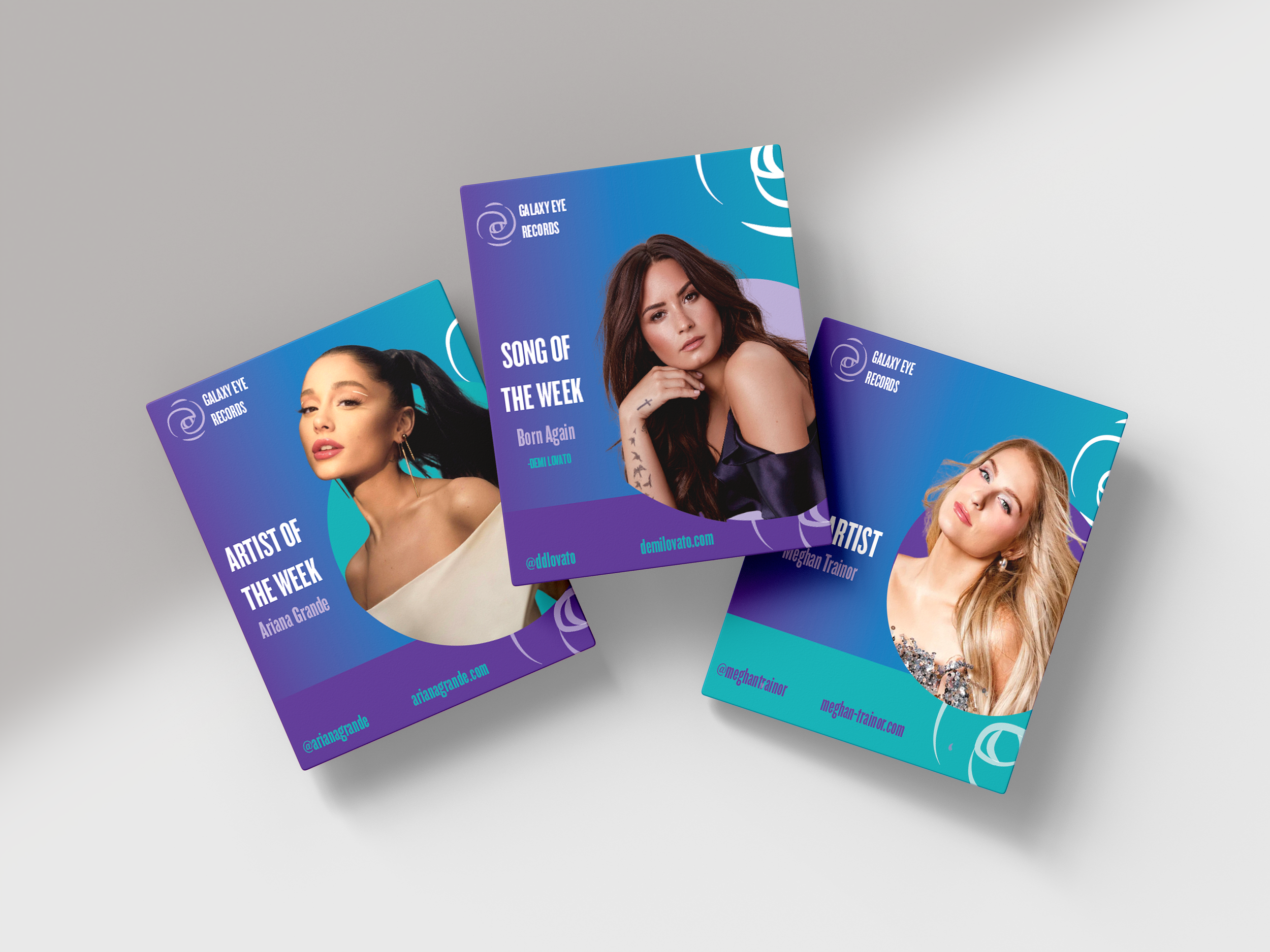


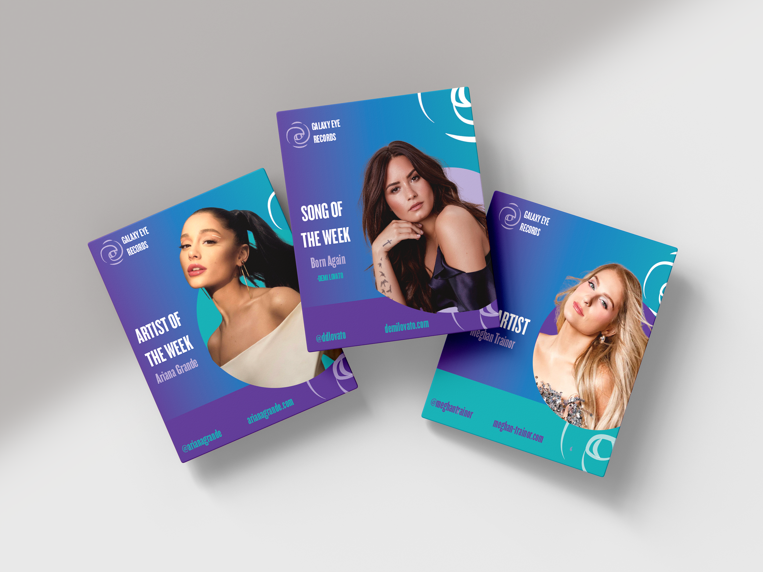
Design Intention: Original layout felt disconnected and lacked a clear visual narrative.
The Design didn't fully showcase my technical capabilities or my vision for a cohesisve brand identity.
Problem
Elevated Visuals: Delivered a high-impact, eye-catching design that serves as a stronger representation of my current skill set.
Pivoted from a rushed workflow to a deep dive creative process, ensuring every element had a purpose.
Solution
Target Audience
Primary: “Stan" fandoms and Super Fans (Generation Z and Young Millennials) ages 13-26
Why your UI appeals to them: The bold purple/teal cosmic gradients, massive circular artist portraits, and interactive prompts (like "Click image") mimic the energetic, fast-paced aesthetic of modern social media platforms they already love.
Secondary: Casual Pop Listeners and Music Discovery Seekers (Older Millennials and General Music Consumers) ages 27-40
Why your UI appeals to them: While the site is highly stylized for the super-fans, your clean top navigation menu and visible search bar make it easy for a casual user to instantly find their preferred artist.
User Personas

Avalon, 25
Avalon is deeply embedded in her local art and music scene. For her, Galaxy Eye Records represents a lifestyle. She values the community aspect of music—going to local shows, chatting with musicians, and finding a sense of belonging in .

Aura, 42
Aura has a lifelong love affair with a great pop hook, and for her, Galaxy Eye Records represents the absolute peak of modern production and escapism. She values the pure joy and emotional power of pop music—championing women in the industry, curating the ultimate high-energy playlists, and appreciating artists who know how to deliver a flawless, world-class pop anthem.

Visual Guide
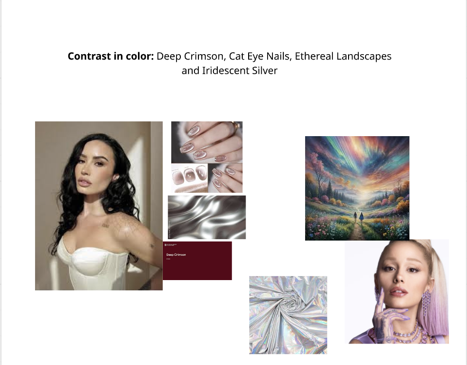
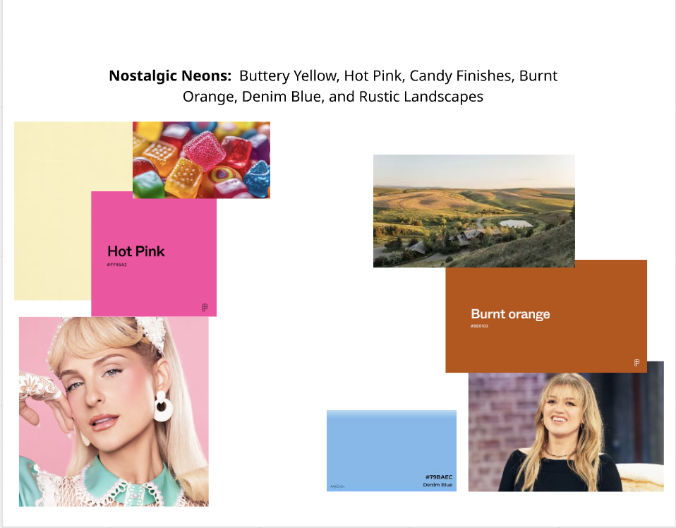
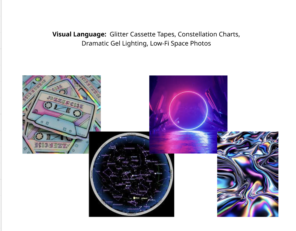
Where celestial wonder meets retro-pop nostalgia. Galaxy Eye Records captures a vivid visual universe grounded in striking color contrast—from deep crimson and iridescent silver to fiery burnt orange and hot pink. Blending low-fi space aesthetics, glitter cassette tapes, and dramatic gel lighting with ethereal landscapes, our aesthetic is a tactile mix of cosmic dreamscapes and nostalgic energy.
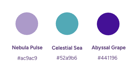
Abyssal Grape (#441196): The anchor color—deep, mysterious, and grounding, representing the dark depths of the galaxy.
Celestial Sea (#52a9b6): The vibrant accent—a bright teal that adds electric contrast and dynamic energy.
Nebula Pulse (#ac9ac9): The soft highlight—a dreamy lavender that connects the palette with an ethereal, muted touch.
Sleek, condensed, and distinctly retro-futuristic, Agency FB brings a sharp, geometric precision to Galaxy Eye Records. Its tall proportions and clean structure echo classic sci-fi design, digital displays, and cosmic archives—giving logo titles a bold, authoritative presence while keeping body text modern and streamlined.

Logo Transition
As seen in the side-by-side comparison the design undergoes a powerful evolution from a rough concept to a polished brand identity. The "Before" version lays down a great foundation with its eye-in-a-vortex motif, but the lines feel tentative and fragmented. The "After" version masterfully resolves this by introducing a cohesive, vibrant purple palette and sweeping, continuous lines that give the logo a much stronger sense of motion, stability, and professional authority.

BEFORE

AFTER
Process
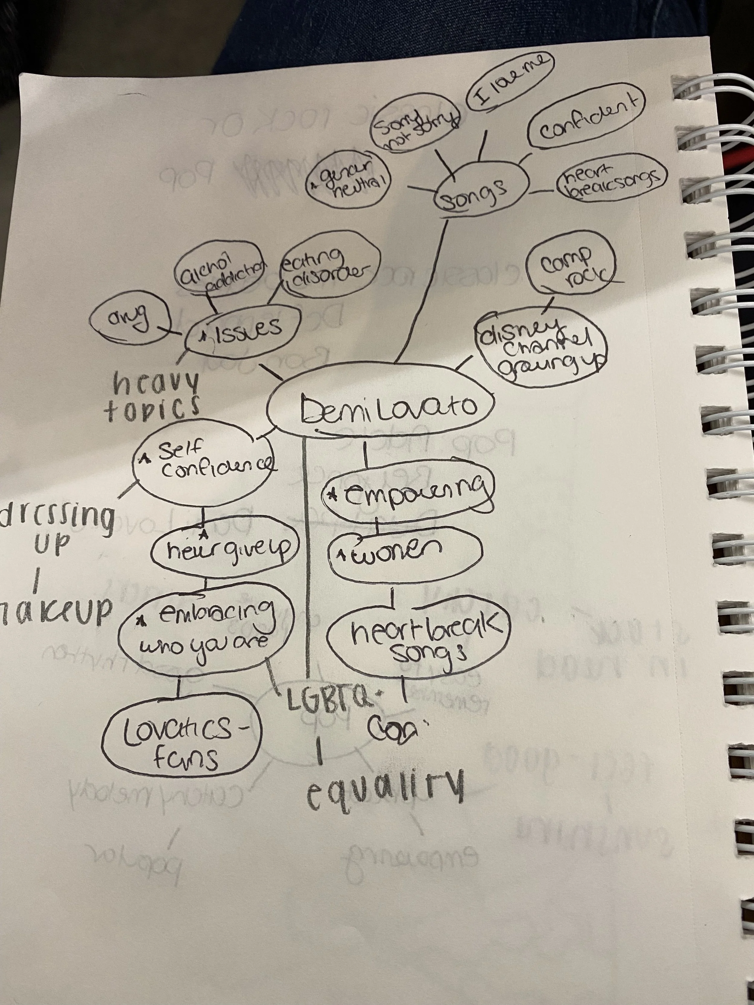
mindmap
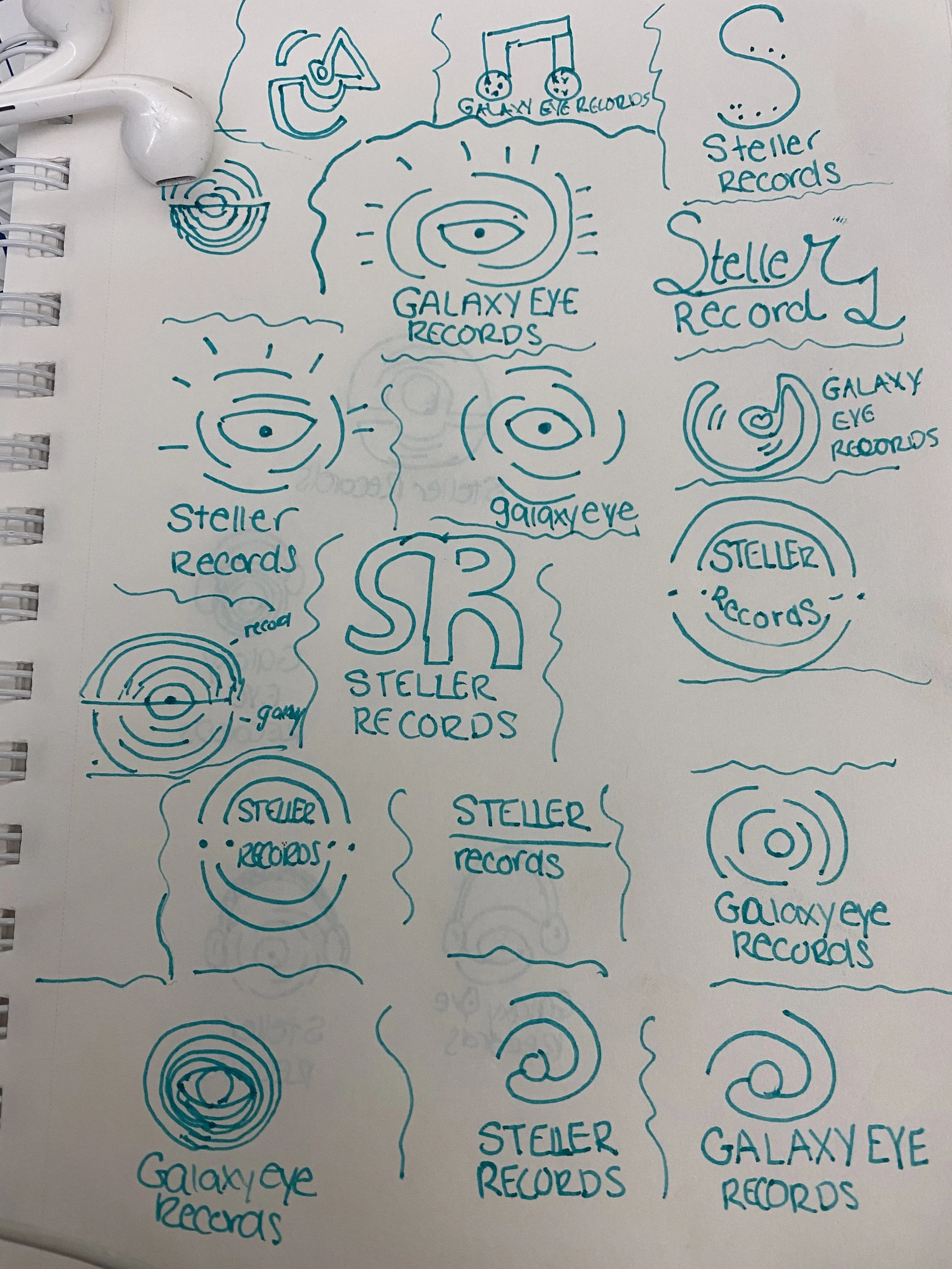
sketches
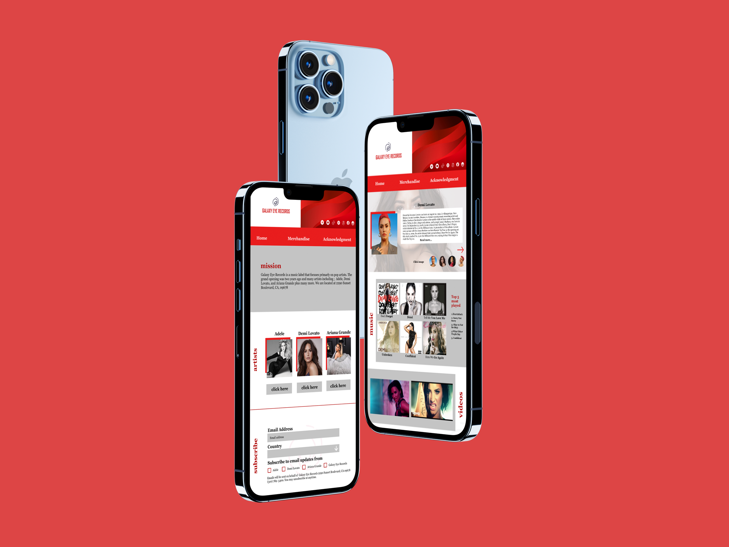
First attempt: Reds, Greys, and Black were the colors, attempt was very rushed since it was a class project.
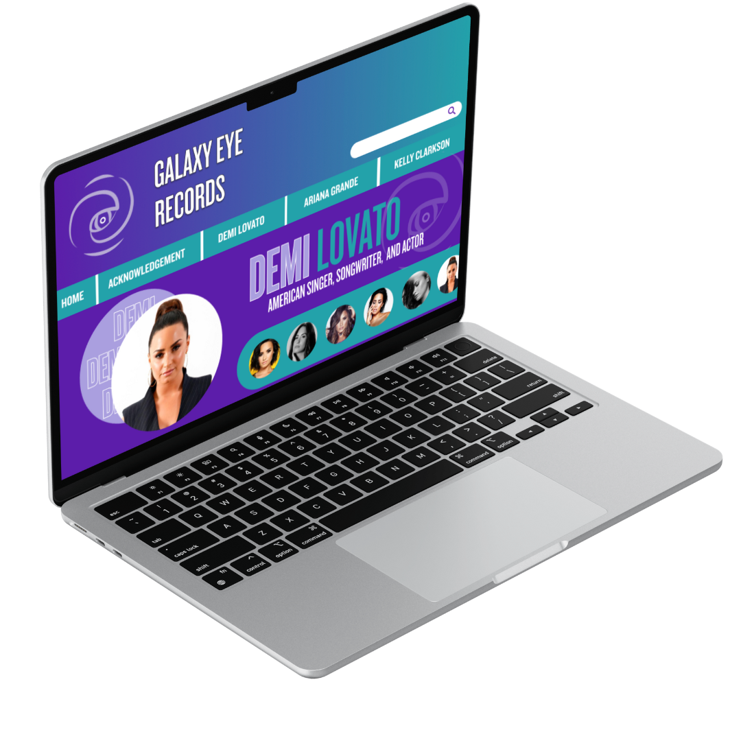
Final attempt: Went down the galaxy color option this time and finished this new revamp design after graduation, in attempt to make it stronger.
Video Prototype