My Personal Identity
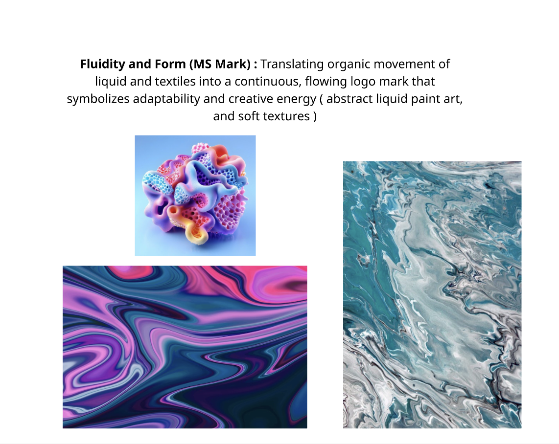
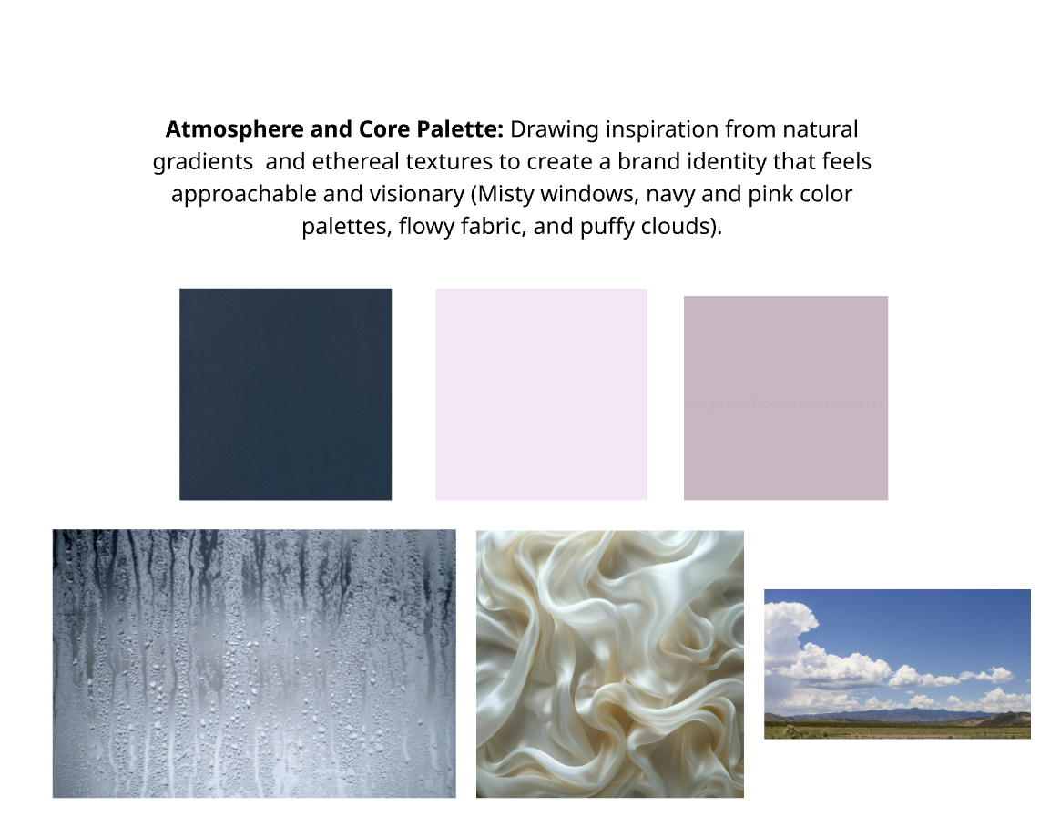
Driven by a philosophy of "professional playfulness," my personal identity is a sensory celebration of form, texture, and digital precision. The visual system bridges the gap between structured UI/UX design and organic, dreamlike aesthetics. Anchored by an ethereal mood board—featuring fluid satin, abstract liquid paint art, and atmospheric light—the brand evokes imagination and curiosity.
Problem
Outdated Visual Identity: My previous branding no longer reflected my current technical skill level or professional growth.
Narrative Gap: my previous identity failed to showcase my diverse background in graphics, UI/UX and Illustration.
Solution
Unified Visual System: Developed a single cohesive brand identity that anchors all professional materials.
Scalable Identity: Created a versatile logo and color system designed to grow alongside my design career.
Target Audience
Primary: Creative Directors & Design Agency Leadership
Secondary: High-Vibe, Impact-Driven Small Businesses & Startups
Visual Guide
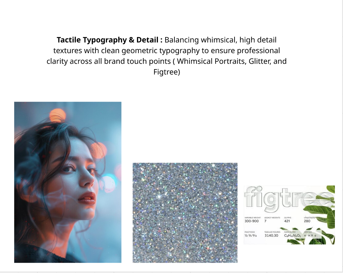
Whimsical Accents: Blends playful, high-detail glitter and dreamy portraits to spark imagination.
Creative Adaptability: Uses colorful, abstract liquid paint art to symbolize flexibility and shifting energy.
Ethereal Mood: Uses misty windows and puffy clouds to create a dreamy, welcoming atmosphere.
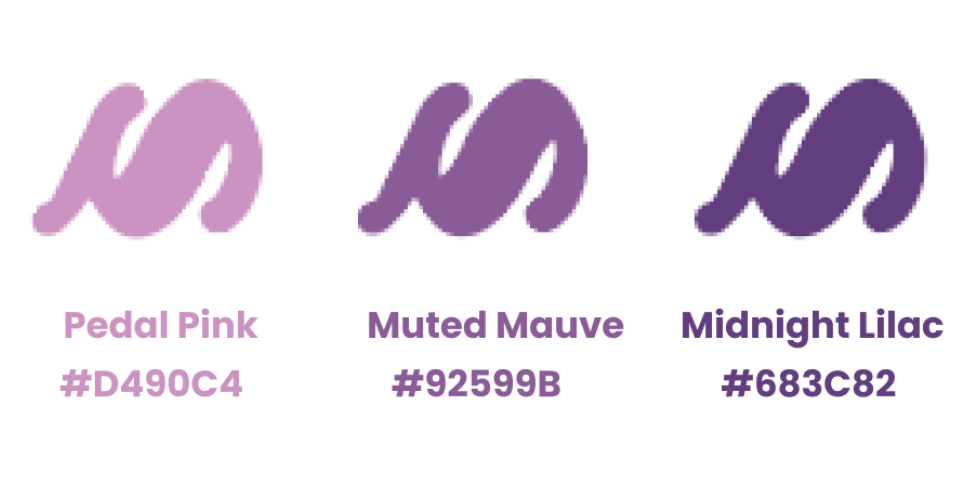
Pedal Pink (#D490C4): A bright, soft orchid shade used to inject creative energy, highlight key details, and add a playful touch.
Muted Mauve (#92599B): A balanced, medium purple mid-tone that seamlessly bridges the vibrant lighter shade with the deeper grounding anchor.
Midnight Lilac (#683C82): A deep, rich purple tone that establishes strong accessibility, professional structure, and elegant contrast across the visual identity.
Expressive & Structured: Combines a high-personality headline typeface with a clean, functional sans-serif for optimal balance.
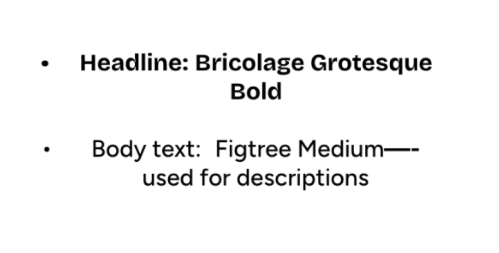
Bricolage Grotesque Bold (Headline): A quirky, stylized typeface used for primary titles to bring creative energy, unique character, and bold visual impact to the identity.
Figtree Medium (Body Text): Employed strictly for descriptions and body copy to anchor the expressive headlines with clean, geometric structure.
Functional Contrast: Ensures excellent screen legibility and effortless reading, balancing playful design flair with professional clarity.
Logo Journey
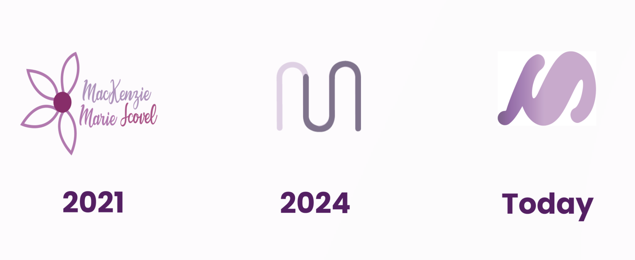
2021: The Foundations
The Vibe: This logo feels introductory and deeply personal. Using a flower motif and full script text represents a stage of exploring identity, carrying a gentle, organic, and approachable creative energy.
2024: The Transition to Minimalism
The Vibe: A massive leap into professional abstraction. By dropping the literal flower and full name text, this mark focuses entirely on form and minimalism. The clean curves show a growing interest in UI/UX and structured brand systems, prioritizing clever simplicity over decoration.
Today: The Refined, Confident Identity
The Vibe: This is the perfect bridge between your past eras. It takes the abstract, professional monogram concept from 2024 but injects it with the playful, fluid, and sensory energy of your current mood board. The heavier weight gives it incredible presence, scalability, and authority, while the sweeping curves make it feel dynamic and artistic rather than rigid.
Logo Breakdown
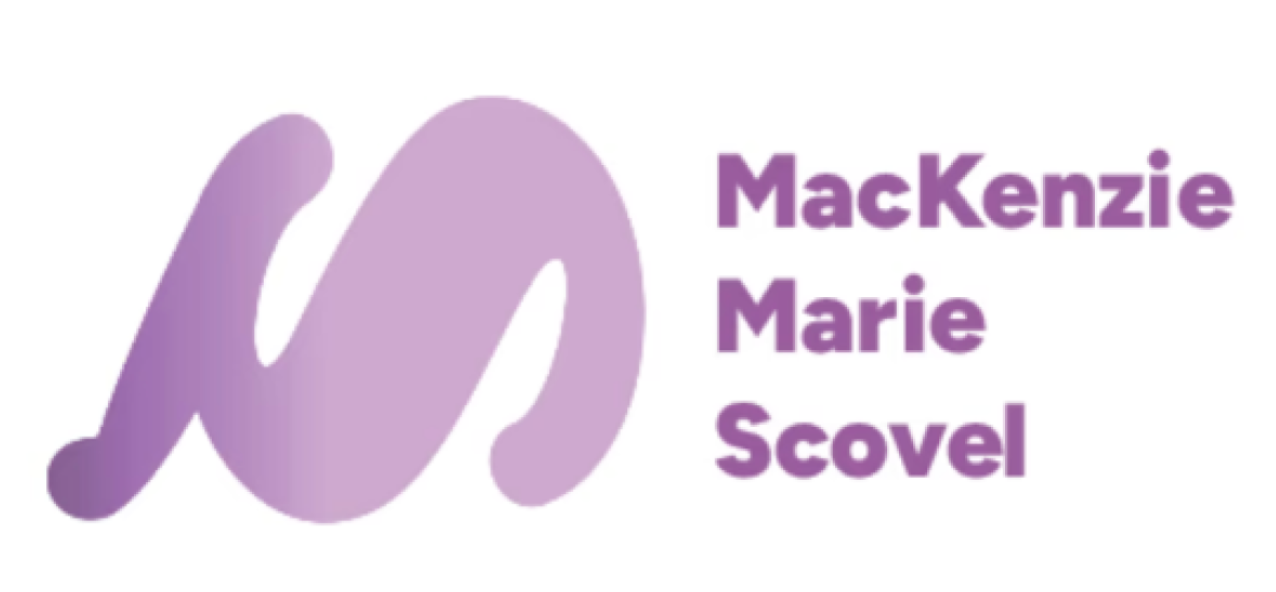
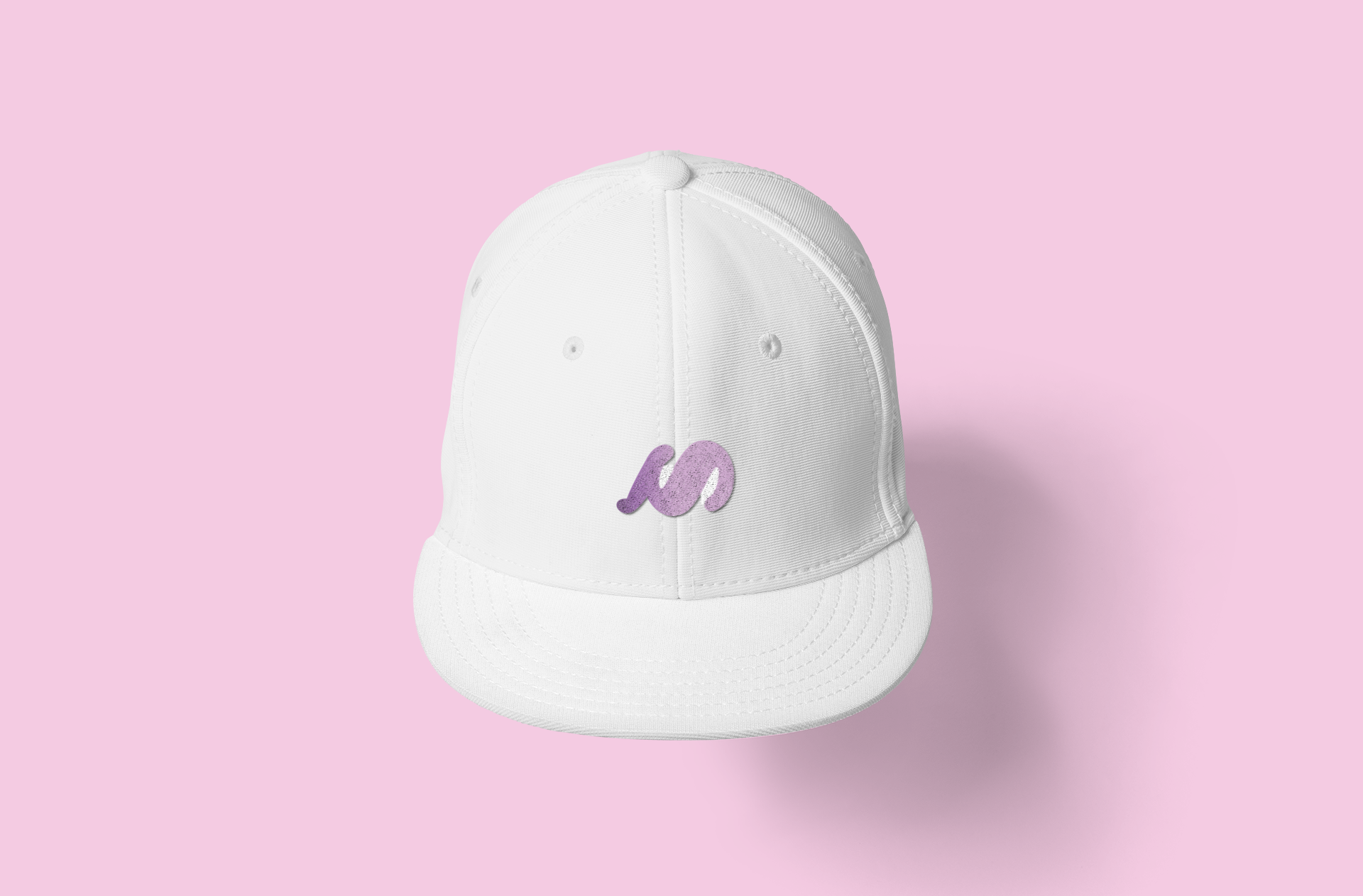
This design is meant to be more than just a literal initial; it’s smooth flowing lines reflects the organic, playful and versatile attributes I bring to every project. By avoiding sharp edges, the logo communicates a sense of creativity, motion and openness. As a constant feature on all my pages of my website ( home, projects, contacts), it anchors a diverse body of work—-from the professional layouts on my resume to the visual projects like “Endo Ease’”and “Galaxy Eye Records”— with a single memorable signature.
Video prototype
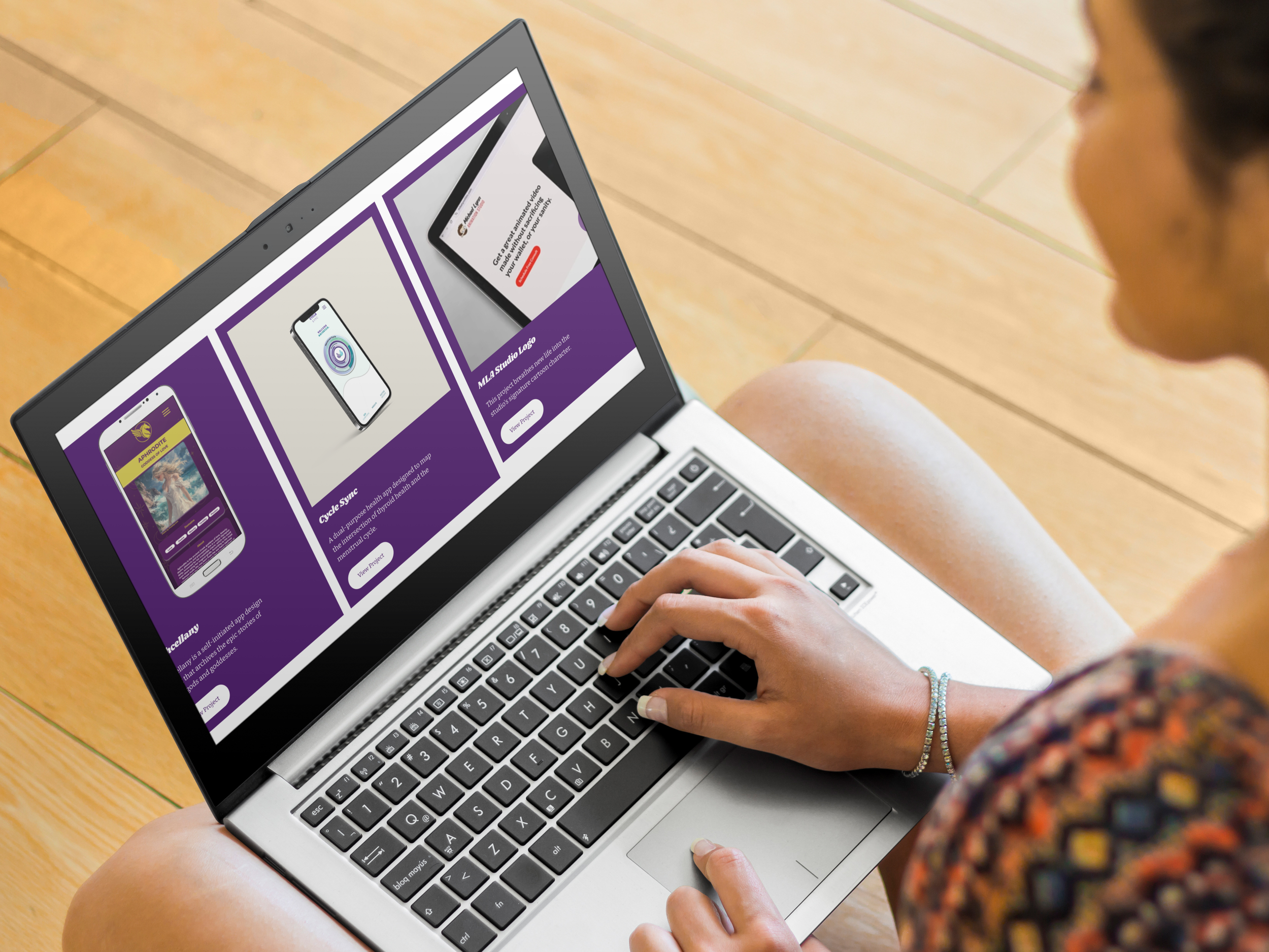
Visual Touchpoints
Desktop
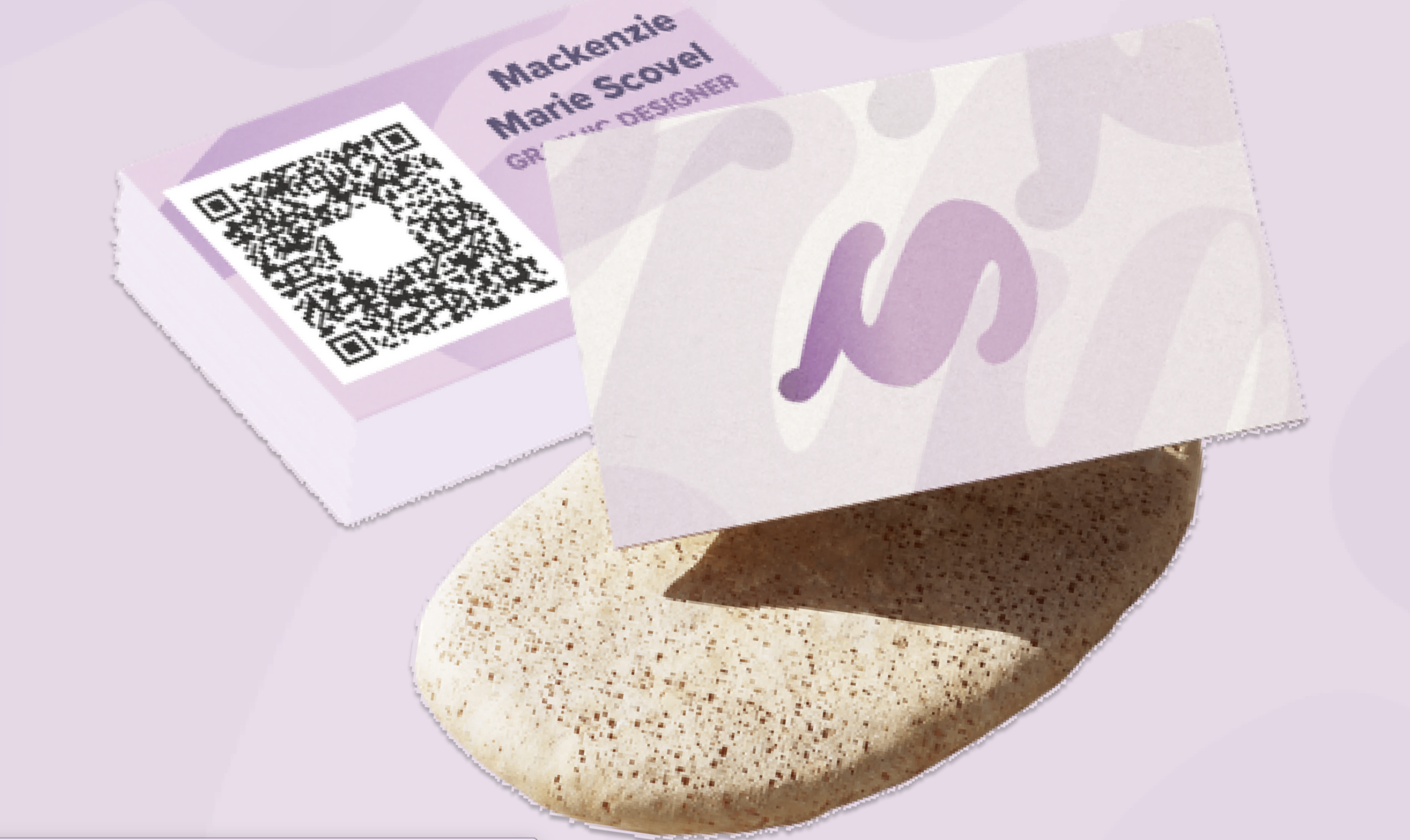
Business Card
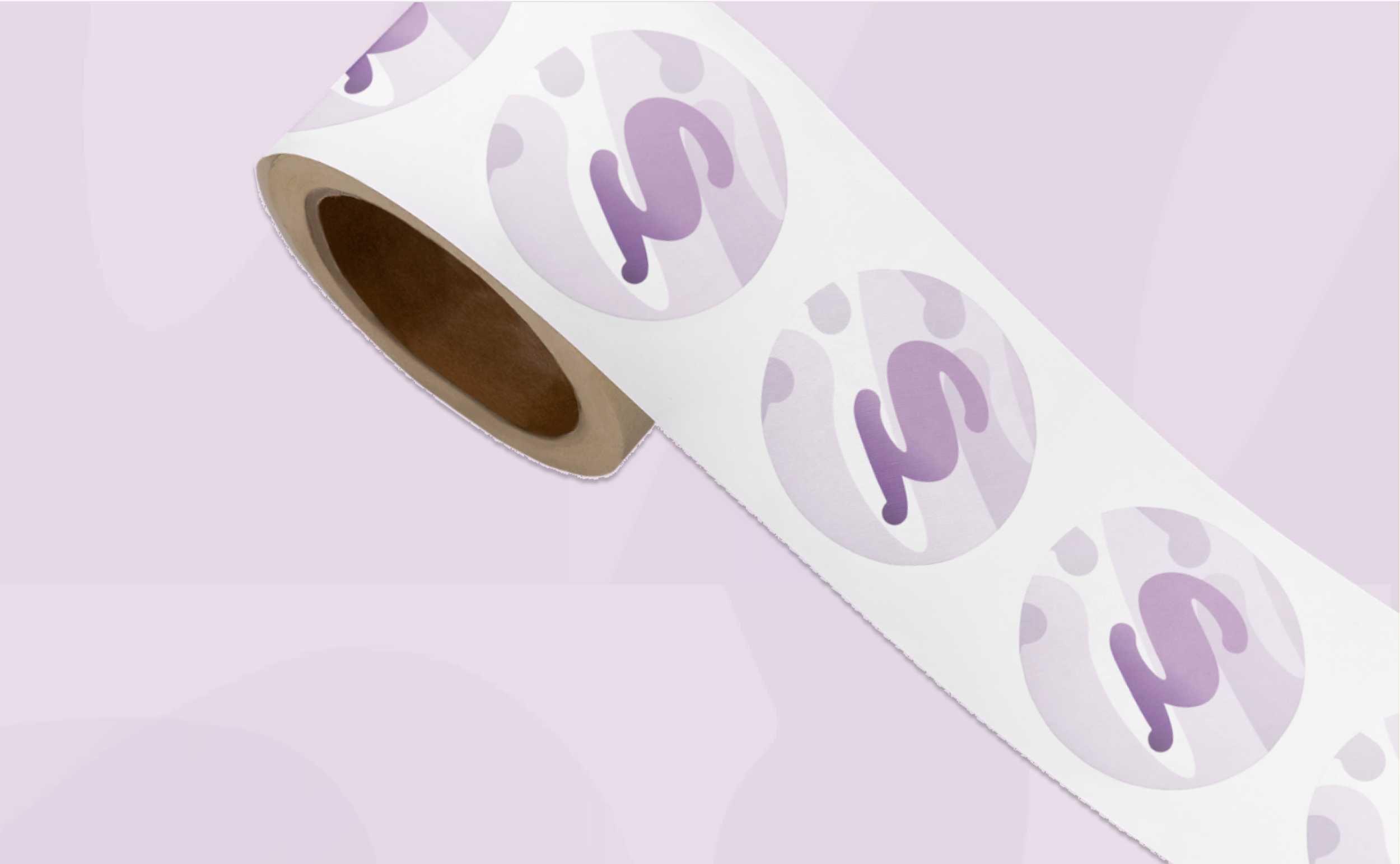
Stickers
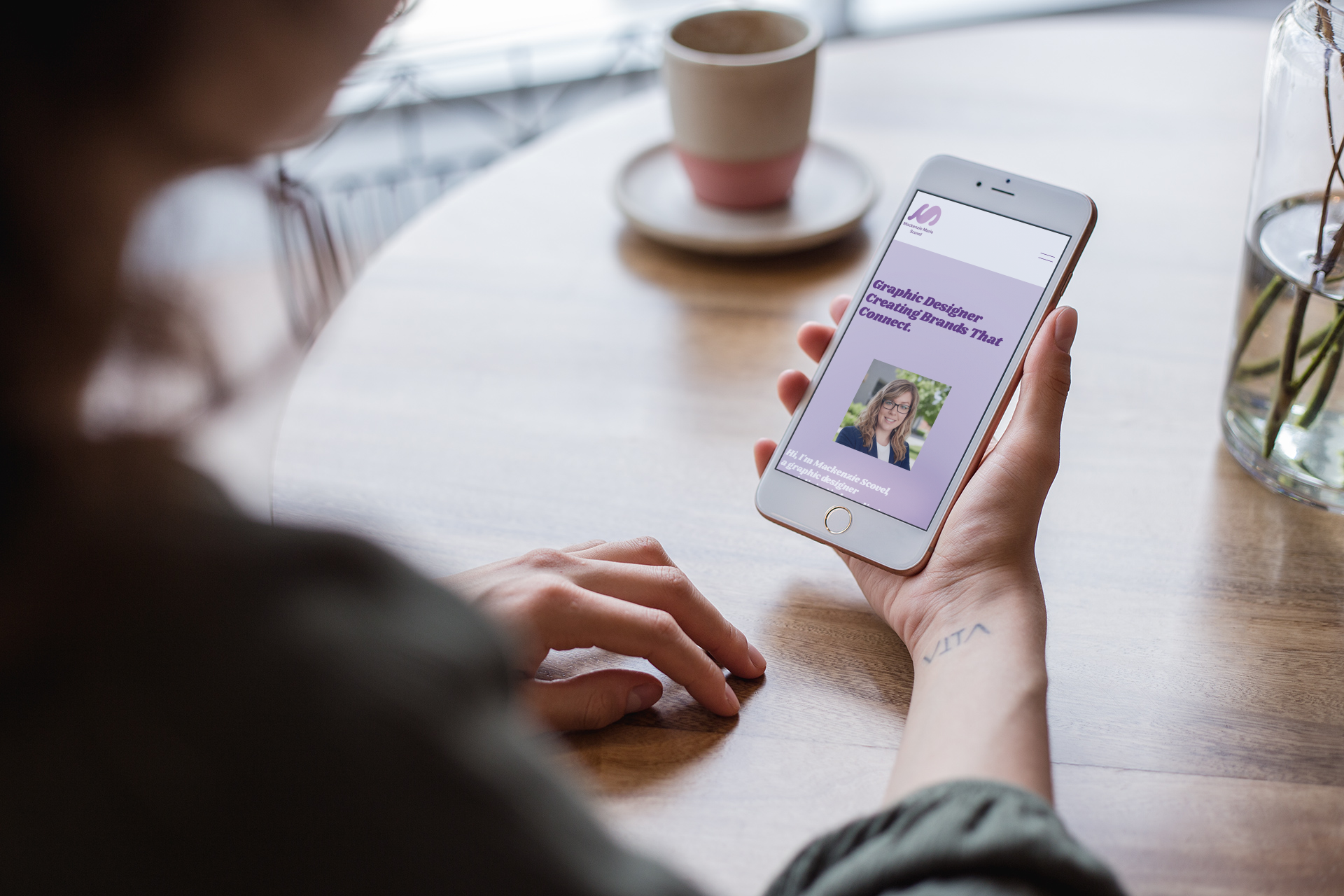
Mobile
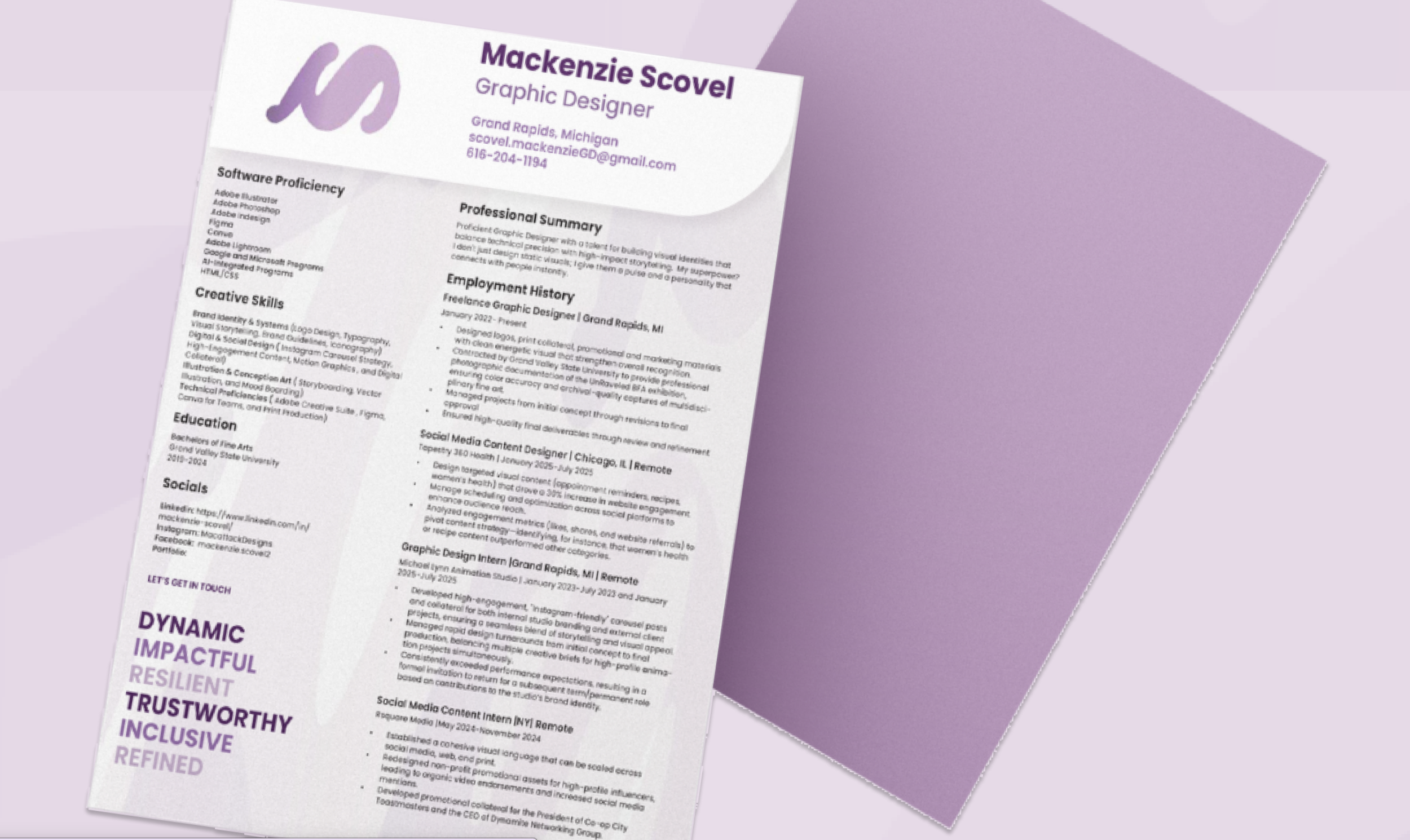
Resume